Gothic letters, also known as blackletter, are among the most visually striking and historically significant calligraphy styles ever created. These dramatic, angular scripts defined the written word across Europe for centuries, from medieval manuscripts and cathedral inscriptions to Gutenberg's first printed Bible. Today, gothic lettering remains hugely popular in tattoo art, logo design, album covers, diplomas, and anywhere that demands a sense of tradition, power, and timeless elegance.
In this guide, we explore the rich history of gothic calligraphy, break down the major blackletter styles, and show you how to start practicing these beautiful medieval letterforms on your own.
A Brief History of Gothic Calligraphy
Gothic calligraphy emerged in the 12th century as European scribes began to develop a more compressed, angular writing style. Before gothic scripts, the dominant calligraphy style was Carolingian minuscule, a rounded, open script developed during Charlemagne's reign. As demand for books grew and parchment remained expensive, scribes needed a way to fit more text onto each page. The solution was to narrow the letterforms, compress the spacing, and replace gentle curves with sharp, angular strokes.
The result was a dense, dark texture of letters on the page, which is why the earliest gothic style became known as "Textura" (from the Latin for "woven fabric"). When you look at a page of Textura calligraphy from a distance, it resembles a tightly woven textile rather than individual letters.
Gothic scripts dominated European writing from roughly 1150 to 1500, and in German-speaking countries, variants like Fraktur remained in common use well into the 20th century. Johannes Gutenberg chose a gothic blackletter font for his famous 42-line Bible in the 1450s, making it one of the first typefaces in the history of printing.
Major Gothic Lettering Styles
Textura (Textualis)
Textura is the oldest and most formal gothic script. It is characterized by its extreme verticality, tight spacing, and diamond-shaped feet at the base of each stroke. The letters are tall, narrow, and closely packed, creating the dense "woven" texture that gives the style its name. Textura was the script of luxury manuscripts, cathedral documents, and eventually Gutenberg's Bible. It is the most recognizable gothic calligraphy style and the one most people picture when they think of "Old English" or "medieval" lettering.
Fraktur
Fraktur emerged in the early 16th century as a more elegant evolution of gothic scripts. While it retains the angular character of blackletter, Fraktur introduces more curves and flourishes, particularly in the uppercase letters. The name "Fraktur" comes from the Latin "fractura" (broken), referring to the broken curves that characterize the style. Fraktur became the standard typeface for German-language printing and remained widely used until the mid-20th century. It is the gothic style most closely associated with German culture and history.
Bastarda (Schwabacher)
Bastarda is a less formal gothic style that blends elements of gothic and cursive writing. It is rounder and more flowing than Textura, making it faster to write and easier to read. The Schwabacher variant was particularly popular in Germany before Fraktur replaced it. Bastarda scripts were commonly used for everyday documents, business correspondence, and less formal books.
Rotunda
Rotunda is the Southern European interpretation of gothic calligraphy. Used primarily in Italy and Spain, Rotunda retains some of the roundness of earlier scripts while incorporating the vertical emphasis and angular details of the gothic tradition. It is wider and more open than Textura, making it more legible. Rotunda was the preferred script for Italian manuscripts and legal documents during the medieval period.
Characteristics of Gothic Letters
Despite the variety of gothic sub-styles, several features unite all blackletter scripts:
- Strong vertical emphasis: the dominant strokes are vertical, creating a rhythm of parallel lines across the page. This verticality gives gothic calligraphy its distinctive upright, authoritative character.
- Dramatic thick-thin contrast: gothic letters feature extreme variation between thick downstrokes and thin connecting strokes. This contrast is created by the angle at which the broad-edged pen meets the paper.
- Angular construction: curves are minimized or broken into angular segments. What would be a smooth curve in other calligraphy styles becomes a series of straight strokes joined at sharp angles.
- Tight spacing: letters are placed close together, often with minimal gaps between words. This dense spacing creates the characteristic dark, textured appearance of blackletter manuscripts.
- Ornamental capitals: while lowercase letters follow strict geometric rules, uppercase letters in gothic calligraphy are often elaborately decorated with flourishes, swirls, and decorative elements.
How to Practice Gothic Calligraphy
Tools You Need
- Broad-edged pen or marker: gothic calligraphy requires a pen with a flat, chisel-shaped nib. Pilot Parallel pens (3.8mm or 6.0mm) are excellent for beginners. Alternatively, a broad-edged calligraphy marker works well.
- Guidelines: gothic lettering requires precise guidelines for x-height, ascender height, and descender depth. A ruled practice sheet or calligraphy workbook is essential.
- Smooth paper: use paper that does not bleed or feather with ink. Marker paper, laser printer paper, or dedicated calligraphy paper all work well.
- Pencil and ruler: for drawing your own guidelines if you are not using a pre-ruled workbook.
Basic Technique
- Hold the pen at a consistent angle: for most gothic scripts, the pen nib should be held at approximately 40-45 degrees to the baseline. This angle creates the characteristic thick-thin contrast.
- Start with basic strokes: before attempting full letters, practice the fundamental strokes: vertical downstrokes, diagonal strokes, and diamond-shaped terminals. These basic elements combine to form every letter in the gothic alphabet.
- Build letters from strokes: gothic letters are constructed from a small set of repeated strokes. A lowercase "n", for example, consists of two vertical downstrokes connected by a thin diagonal stroke at the top.
- Maintain consistent spacing: the space between strokes within a letter should equal the space between letters. This creates the even, woven texture that defines gothic calligraphy.
- Practice the lowercase alphabet first: the lowercase letters follow more consistent rules and are easier to master. Once comfortable with lowercase, move to the more ornamental uppercase letters.
Gothic Lettering in Modern Design
Gothic calligraphy is far from obsolete. Its dramatic visual impact makes it one of the most sought-after styles in contemporary design:
- Tattoo art: gothic blackletter is one of the most popular tattoo lettering styles, especially for names, dates, and short powerful phrases
- Music and entertainment: metal bands, hip-hop artists, and fashion brands frequently use blackletter for logos and album artwork
- Certificates and diplomas: gothic-style lettering adds formality and prestige to official documents
- Brand identity: newspapers like The New York Times and The Washington Post use blackletter-inspired mastheads
- Digital design: gothic fonts remain popular in web design, gaming, and app interfaces for projects with medieval or dark fantasy themes
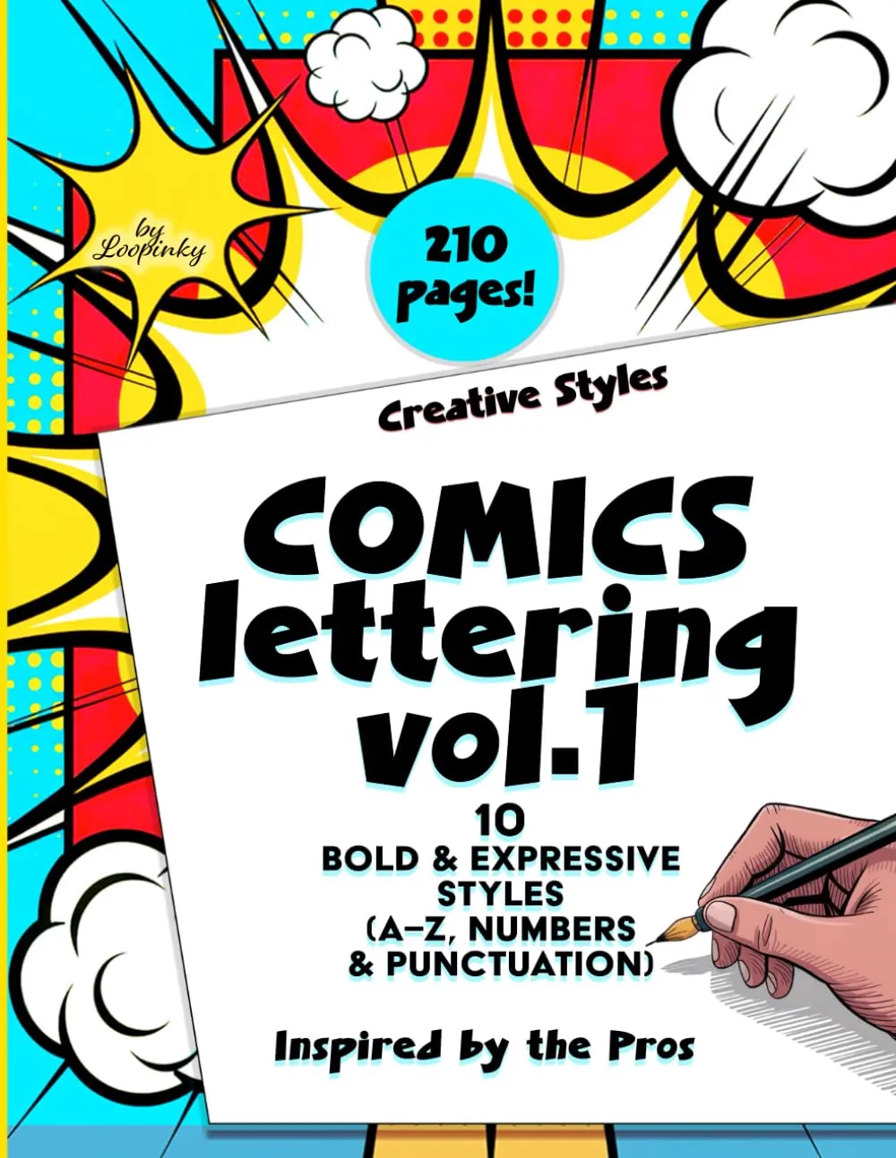
Comics Lettering Vol.1
10 bold lettering styles including gothic-inspired alphabets. Build your foundational hand lettering skills with complete A-Z alphabets and guided practice. 210 pages.
Buy on Amazon - $14.99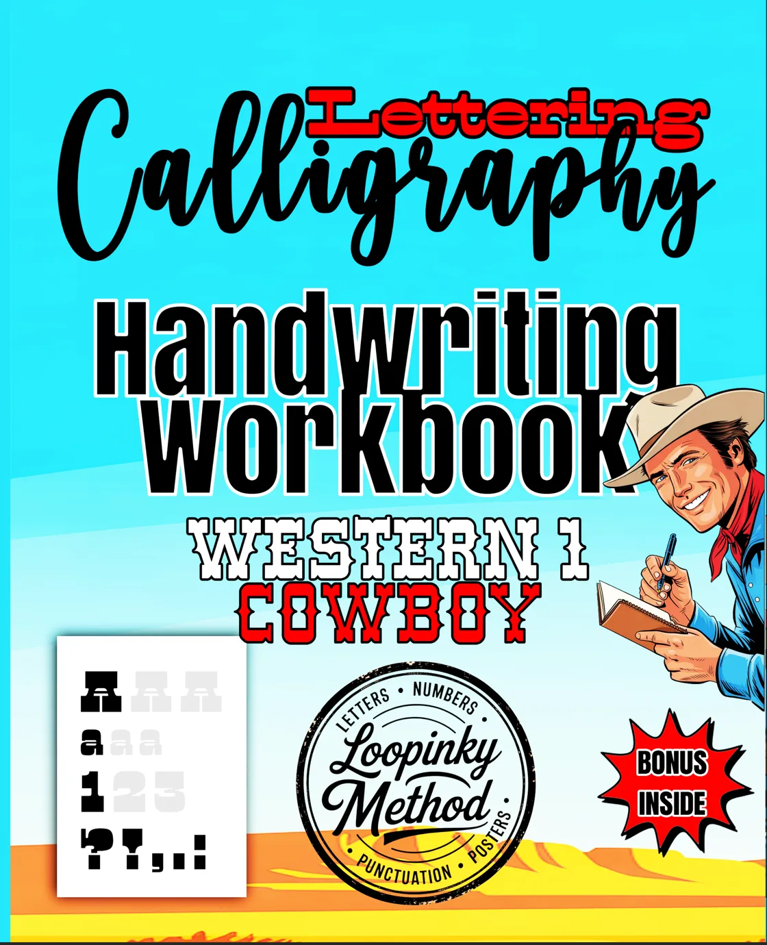
Western Cowboy Calligraphy
Western-style lettering with bold, decorative alphabets that complement gothic calligraphy practice. 108 pages of guided exercises.
Buy on Amazon - $9.99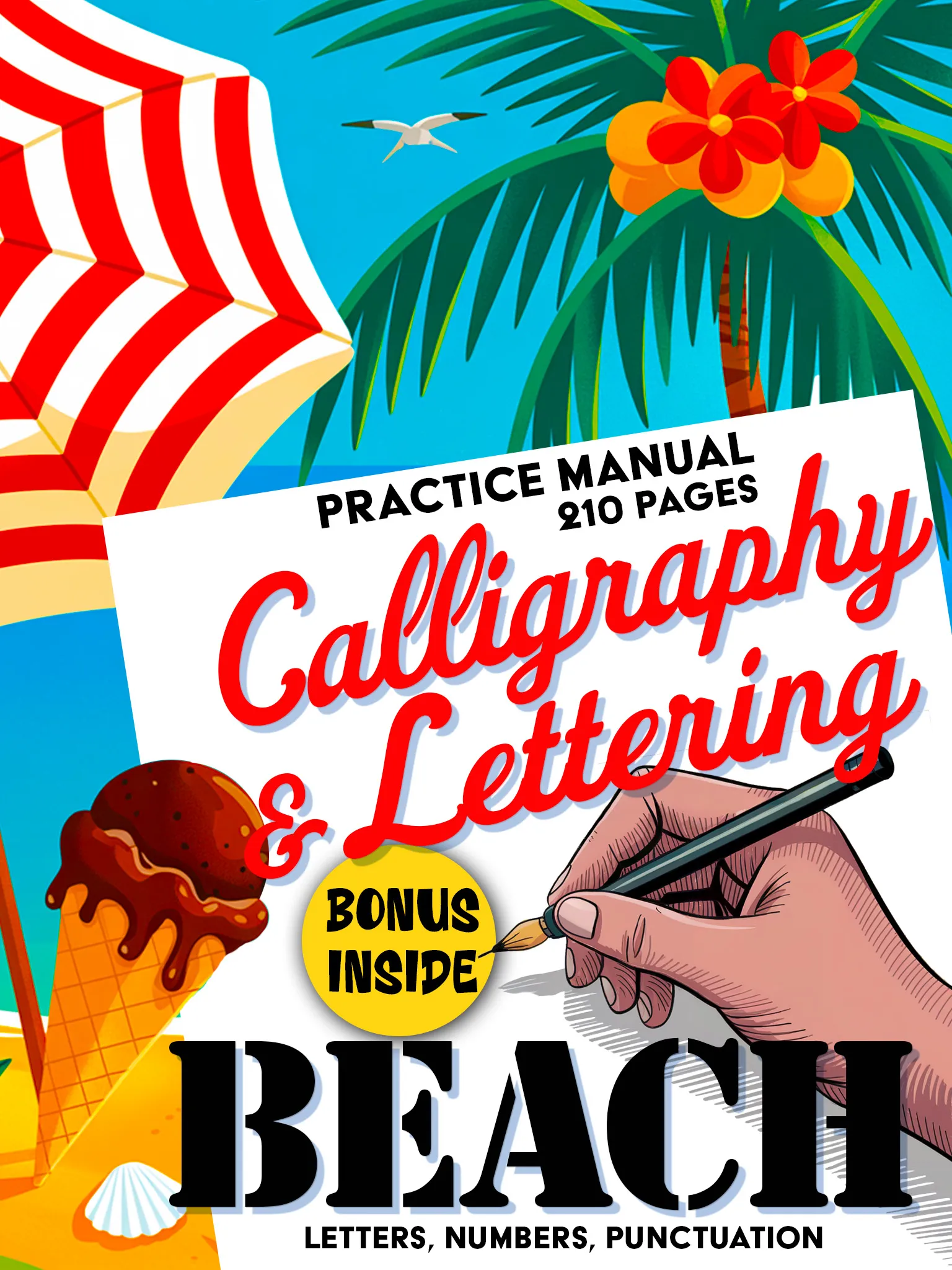
Beach Premium Calligraphy
Elegant calligraphy styles that develop the pen control and stroke consistency needed for gothic lettering. 210 pages of premium practice.
Buy on Amazon - $14.99Tips for Learning Gothic Calligraphy
- Start with a larger nib size: a wider nib (6mm) makes it easier to see the thick-thin contrast and understand the stroke mechanics before moving to smaller sizes.
- Study historical examples: look at medieval manuscripts online. The British Library, the J. Paul Getty Museum, and many university libraries have digitized collections you can study for free.
- Be patient with uppercase letters: gothic capitals are significantly more complex than lowercase letters. Master the lowercase alphabet before spending time on uppercase.
- Practice consistency: gothic calligraphy demands mechanical precision. Every downstroke should be the same width, every space the same distance.
- Use a lightbox or tracing paper: tracing exemplar alphabets helps build muscle memory for the distinctive gothic letterforms.
- Join a calligraphy community: online forums, Instagram calligraphy groups, and local workshops provide feedback, inspiration, and accountability.
Gothic calligraphy connects us to centuries of written tradition. Every stroke of blackletter carries the weight of medieval scholarship, the precision of master scribes, and a visual power that no modern font can quite replicate.
Ready to begin your gothic calligraphy journey? Browse the Loopinky calligraphy collection and start building the hand lettering skills that form the foundation for every calligraphic style.