You do not need a brush pen, a dip nib, or any special tools to create stunning calligraphy-style lettering. Faux calligraphy is a technique that lets you achieve the beautiful thick-and-thin contrast of professional calligraphy using nothing more than a regular ballpoint pen, a gel pen, or even a pencil. It is the perfect entry point for anyone curious about hand lettering, and it produces results that look genuinely impressive from the very first attempt.
What Is Faux Calligraphy?
Faux calligraphy, sometimes called fake calligraphy or cheater calligraphy, is a technique where you manually add thickness to your downstrokes after writing. In real brush calligraphy, the thick-thin variation happens naturally because of pressure changes on a flexible brush tip. In faux calligraphy, you simulate that effect by drawing a second line alongside each downstroke and then filling in the space between.
The end result looks remarkably similar to brush calligraphy. From a normal viewing distance, most people cannot tell the difference. And the beauty of the technique is that it works with literally any writing instrument, on any surface. You can do faux calligraphy on a chalkboard, a gift tag, a whiteboard, a ceramic mug, or even a rock. Try doing that with a brush pen.
Step-by-Step: How to Do Faux Calligraphy
The process is simple, but mastering it takes a bit of practice. Here is how to get started:
Step 1: Write in cursive
Start by writing your word or phrase in regular cursive handwriting. Use any pen you like. Do not worry about making it perfect. The key is to write with slightly wider spacing between strokes than you normally would, because you will need room to add thickness later. Keep your letters connected and flowing, just as you would in normal cursive.
Step 2: Identify the downstrokes
Look at each letter you wrote and identify every stroke where your pen moved downward. In the letter "a," for example, the left side of the oval and the right-side stem are downstrokes. In the letter "h," the main vertical stroke and the right side of the hump are downstrokes. Every time your pen traveled from top to bottom, that is a downstroke.
Step 3: Draw a parallel line next to each downstroke
Using the same pen, draw a second line right next to each downstroke. You can place it on either side, but be consistent throughout the word. Most people find it easiest to add the line on the right side of each downstroke. This creates a narrow channel between the original stroke and the new line.
Step 4: Fill in the gap
Color in the space between the original downstroke and the parallel line. This gives each downstroke a thicker appearance, creating the signature thick-thin contrast that makes calligraphy so visually striking. Take your time with this step and keep the edges clean.
Step 5: Clean up and refine
Go back over your letters and smooth out any rough edges. Check that your upstrokes (the thin lines) are consistently thin and your downstrokes (the filled-in sections) are consistently thick. Small imperfections are fine and actually add to the handmade charm, but major inconsistencies will break the illusion.
Common Mistakes and How to Avoid Them
Even though faux calligraphy is beginner-friendly, there are a few pitfalls that can make your results look less polished:
- Not leaving enough space: if your initial cursive is too tight, there will not be room to add thickness. Write with a bit more breathing room than usual
- Thickening upstrokes: only downstrokes get thickened. Upstrokes stay thin. This is the number one rule of calligraphy, real or faux
- Inconsistent thickness: try to make all your thickened downstrokes roughly the same width. This consistency is what makes the lettering look professional
- Rushing the fill: take your time filling in the channels. Messy fills are the most visible flaw in faux calligraphy
- Forgetting curves: downstrokes are not always perfectly vertical. In letters like "o," "e," and "s," the downstroke curves, and your thickening line should follow that curve
Where Faux Calligraphy Shines
Faux calligraphy is not just a stepping stone to real calligraphy. It has genuine advantages in certain situations:
- Unusual surfaces: chalkboards, wooden signs, ceramics, fabric, and glass are all difficult or impossible for brush pens but perfect for faux calligraphy with the right marker
- Large-scale lettering: when you need letters bigger than what a brush pen can handle, faux calligraphy scales beautifully
- Travel and spontaneity: you always have a ballpoint pen handy, but you probably do not carry brush pens everywhere
- Bullet journals: many journalers prefer faux calligraphy because it works with the same pen they use for writing, with no tool switching needed
From Faux to Real: The Natural Next Step
If you enjoy faux calligraphy, you will likely want to explore real brush pen calligraphy at some point. The good news is that faux calligraphy teaches you the most important calligraphy fundamental: identifying and differentiating downstrokes from upstrokes. This knowledge transfers directly to brush pen work.
The transition from faux to real calligraphy is where a good workbook becomes invaluable. Instead of figuring out brush pen pressure control on your own through trial and error, a structured workbook guides you through the exact strokes, letterforms, and practice sequences that build real skill.
Loopinky Beach Premium: Your Bridge to Real Calligraphy
Loopinky's Beach Premium workbook is an excellent next step after faux calligraphy. This 210-page premium manual teaches fluid, ocean-inspired calligraphy scripts with the same thick-thin contrast you have been simulating with the faux technique, but now created naturally through pen pressure. The workbook breaks each letterform into individual strokes, making the transition from faux to real feel seamless.
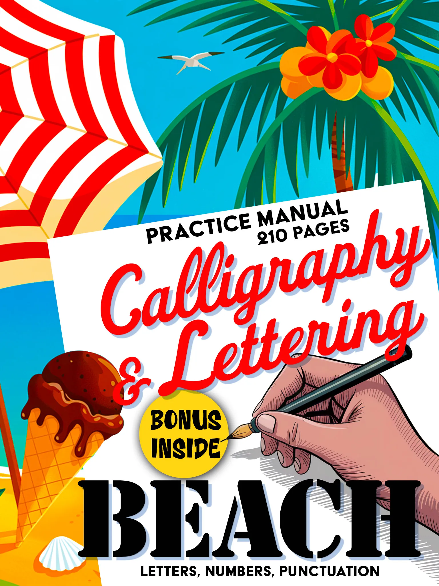
Calligraphy & Lettering: Beach Premium
Premium 210-page calligraphy manual. Fluid scripts, decorative elements and creative layouts.
Buy on Amazon - $14.99Loopinky Drift: Multiple Styles to Develop Versatility
Once you are comfortable with basic brush pen calligraphy, Loopinky's Drift workbook offers five distinct ocean-inspired styles to expand your range. Each style requires slightly different pressure control and stroke angles, which accelerates your learning and keeps practice interesting. The variety prevents the plateau that many beginners hit when practicing a single style.
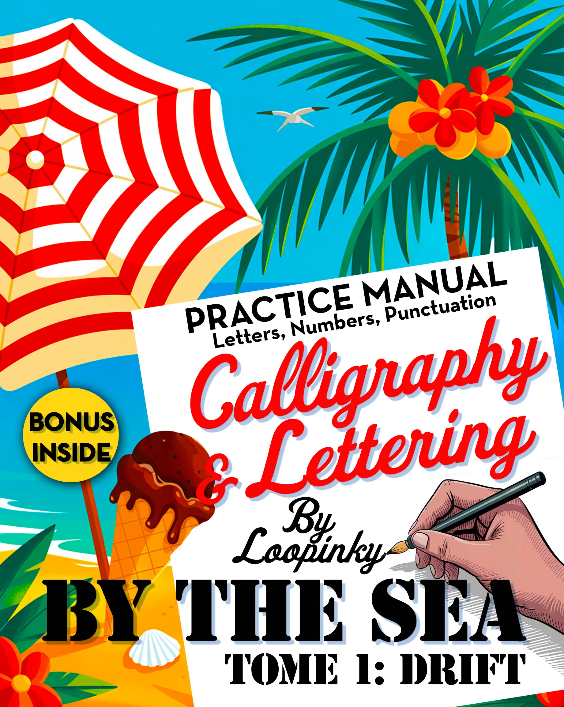
Calligraphy & Lettering: Drift
5 unique ocean-inspired lettering styles. Full alphabets, numbers & punctuation.
Buy on Amazon - $9.99Loopinky Comics Vol. 1: A Completely Different Challenge
For those who want to take their lettering in an unexpected direction, Loopinky's Comics Vol. 1 workbook teaches comic book and pop art inspired lettering styles across 210 pages. These styles use thick-thin contrast in bold, graphic ways that are very different from traditional calligraphy but equally rewarding to master. It is a great way to apply your faux calligraphy foundation to a whole new genre.
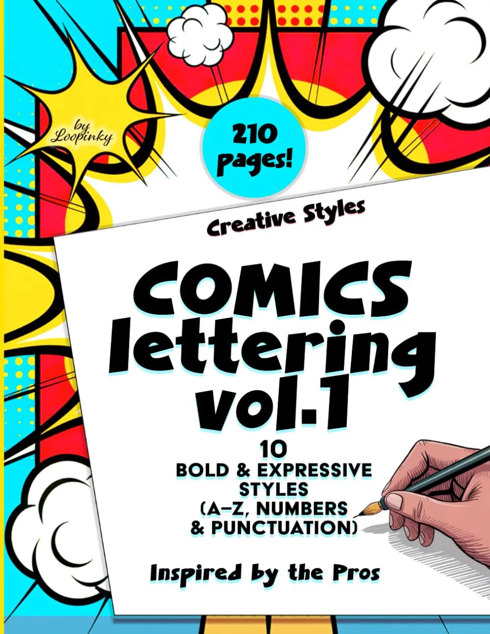
Calligraphy & Lettering: Comics Vol. 1
Comic & pop art inspired lettering. 210 pages of bold, graphic styles.
Buy on Amazon - $14.99Faux calligraphy is not cheating. It is learning. Every filled-in downstroke teaches your brain the same thick-thin principle that governs real calligraphy. You are training your eye long before you train your hand.
Practice Tips for Better Faux Calligraphy
- Start with short words: practice with three to five letter words before attempting full quotes or phrases
- Use graph paper or dotted paper: the grid helps you keep your letter heights and downstroke widths consistent
- Study real calligraphy alphabets: look at how professional calligraphers form their letters and use those shapes as your cursive base
- Try different pens: a fine-tip pen gives delicate results, while a thicker marker creates a bolder effect
- Practice the same word repeatedly: write a single word five times in a row and compare the first to the last, your improvement will surprise you
Faux calligraphy is where many of today's best lettering artists started. It requires no investment, no special tools, and no previous experience. All you need is a pen and the willingness to slow down and enjoy the process. And when you are ready to take the next step, explore the Loopinky collection for guided workbooks that will transform your faux technique into real calligraphy skill.