If you work in graphic design, you already know that typography can make or break a project. You have spent hours choosing the right font, adjusting kerning and tweaking line heights. But here is something most design schools do not teach: practicing hand lettering, particularly comics-style lettering, can fundamentally transform how you understand and work with type in your professional projects.
Comics lettering is not just for comic book artists. It is a discipline that teaches you to think about letterforms in ways that digital font selection never can. And the skills you develop transfer directly to logo design, poster typography, packaging, branding and any project where type needs to do more than just convey information.
Why Graphic Designers Should Practice Hand Lettering
When you select a font from a dropdown menu, you are choosing from someone else's creative decisions. When you draw letters by hand, you are making those decisions yourself. This distinction matters more than most designers realize.
Hand lettering practice trains your eye to notice the subtle details that separate good typography from great typography: the weight distribution in a stroke, the rhythm of spacing, the personality embedded in a curve. After spending time drawing letters by hand, you start seeing these details everywhere, including in the digital typefaces you use daily.
Comics lettering specifically develops skills that are hard to build any other way:
- Bold visual impact: comics letters must be readable at a glance, teaching you how to create type that commands attention
- Emotional expression through type: a "BAM!" looks fundamentally different from a whispered word, and learning to convey that difference trains your typographic instincts
- Consistency under constraints: lettering within speech bubbles and panels teaches you to maintain style while adapting to space limitations
- Multi-style fluency: comics use drastically different lettering for narration, dialogue, sound effects and titles, building versatility
How Comics Lettering Improves Logo Design
Logo design is arguably where hand lettering skills pay off the most. The best logos in the world are not set in existing fonts. They are custom letterforms designed specifically for the brand. Think of the Coca-Cola script, the Disney wordmark or any craft brewery logo you have ever admired.
When you practice comics lettering, you learn to create letters with distinct personality. Each style has its own rules about stroke weight, angles, decoration and rhythm. This is exactly what you need when designing a logotype: the ability to create letterforms that feel unique to a specific brand rather than generic.
Comics lettering also teaches you to think about letters as shapes rather than just carriers of meaning. This spatial awareness is crucial when you need to make a wordmark work at different sizes, in different contexts and across different media.
Poster Design and Display Typography
Posters demand type that grabs attention from across a room. This is where comics lettering training becomes directly applicable. The bold, high-impact styles you practice in a comics lettering workbook translate naturally to event posters, concert flyers, movie titles and any design where type needs to be the hero.
Consider the typography on a vintage movie poster or a rock concert announcement. The lettering is almost always hand-drawn or hand-inspired, with the kind of personality and energy that no standard font can replicate. By practicing comics lettering, you develop the ability to create that energy on demand.
Packaging and Branding Applications
The packaging industry has seen a massive shift toward hand-lettered design in recent years. Craft beer labels, artisanal food packaging, cosmetics branding and boutique fashion tags increasingly feature custom lettering rather than standard typefaces. This trend rewards designers who can create original letterforms.
Comics lettering practice is particularly valuable here because it teaches you to work with extreme variety. In a single comics lettering workbook, you might practice ten completely different styles, from bold block letters to fluid, organic forms. This range of experience makes you more versatile when a client needs something that feels "handmade but professional" or "bold but approachable."
Professional Practice Tools
If you are convinced that hand lettering practice is worth your time (and it absolutely is), the question becomes: where do you start? For graphic designers specifically, we recommend workbooks that emphasize variety and bold styles rather than traditional calligraphy.
Loopinky Comics Lettering Vol.1
This is our top recommendation for graphic designers. With 10 distinct lettering styles across 210 pages, it provides the kind of varied practice that builds real typographic versatility. Each style includes complete A-Z alphabets, numbers and punctuation, so you learn each style thoroughly rather than superficially. Styles range from aggressive, angular forms to rounded, playful shapes, giving you a broad vocabulary of letterforms to draw from in your professional work.
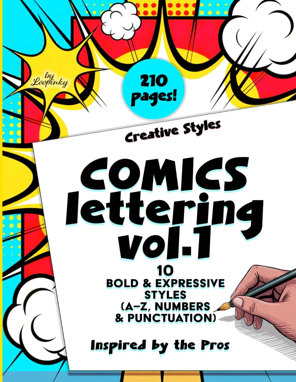
Comics Lettering Vol.1
10 bold styles, complete A-Z alphabets, numbers & punctuation. 210 pages of guided exercises.
Buy on Amazon - $14.99Loopinky Comics Lettering Vol.2
Once you have worked through Vol.1, Vol.2 expands your repertoire with additional styles. For designers looking to build a comprehensive hand lettering skill set, working through both volumes provides an exceptional foundation. The progression from Vol.1 to Vol.2 also mirrors how professional skills develop: you start with foundational forms and then push into more complex, nuanced territory.
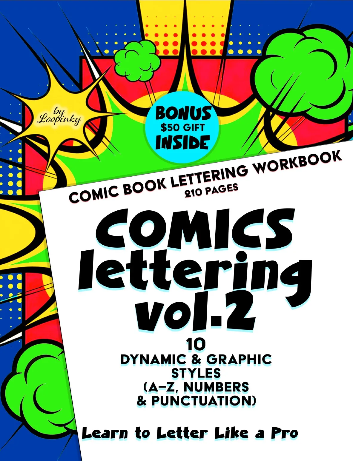
Comics Lettering Vol.2
More bold styles, complete alphabets, numbers & punctuation. The perfect sequel to Vol.1.
Buy on Amazon - $14.99Loopinky Calligraphy & Lettering: Beach Premium
While comics lettering focuses on bold, impactful forms, the Beach Premium workbook develops your fluidity and elegance. For a graphic designer, having both bold and refined lettering skills creates a complete typographic toolkit. The cursive styles in Beach Premium are particularly useful for luxury branding, wedding design, beauty packaging and editorial typography.
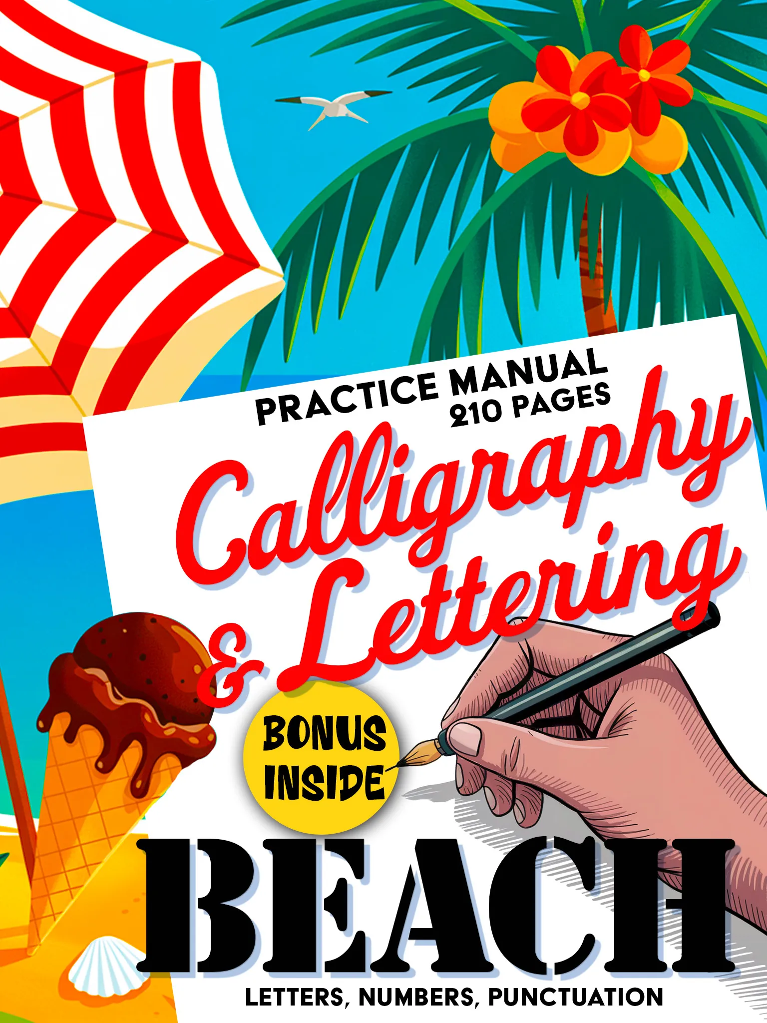
Calligraphy & Lettering: Beach Premium
Premium 210-page calligraphy manual. Fluid scripts, decorative elements and creative layouts.
Buy on Amazon - $14.99Integrating Hand Lettering into Your Digital Workflow
Practicing hand lettering does not mean abandoning digital tools. The most effective approach for professional designers is to use hand lettering practice as a foundation that enhances your digital work:
- Sketch first, digitize second: start logo concepts by hand-drawing letterforms, then refine them in Illustrator or Figma. The hand-drawn starting point produces more original results.
- Build your own reference library: as you practice different lettering styles, photograph or scan your best work. These become reference points when starting new design projects.
- Use practice to warm up: spending 15-20 minutes on hand lettering before a design session sharpens your eye and loosens your creative thinking.
- Develop style awareness: when you can identify what makes a lettering style feel "aggressive" versus "friendly" versus "luxurious" because you have drawn all three, you make better font choices in every project.
The Competitive Advantage
In a market where every designer has access to the same fonts through Adobe Fonts, Google Fonts and type foundries, hand lettering skills become a genuine differentiator. Clients increasingly want custom, ownable typography that no competitor can replicate simply by purchasing the same license. A designer who can sketch original letterforms, whether for a full logotype or just a few hero words, brings something to the table that a purely digital designer cannot match.
The investment is minimal: a practice workbook, a set of markers and 20 minutes a day. The return is a deeper understanding of type, more original design work and a skill set that separates you from the crowd. Start with comics lettering because it is the most directly applicable to bold, commercial design work, and expand from there.
The best typographers are not the ones who know the most fonts. They are the ones who understand letterforms deeply enough to create their own. Hand lettering practice is how you get there.