There's something undeniably charming about chalkboard lettering. From cafe menu boards and wedding signs to kitchen decor and classroom displays, beautifully hand-lettered chalkboards add warmth, personality, and a handmade touch that printed signs simply can't match. The rustic, slightly imperfect aesthetic of chalk on a dark surface has a timeless appeal that continues to trend year after year.
But creating professional-looking chalkboard lettering isn't as simple as picking up a piece of chalk and writing. It requires planning, the right tools, and an understanding of techniques that make the difference between amateur scribbles and stunning chalk art. In this guide, we'll cover everything you need to know to create beautiful chalkboard lettering, whether you're a complete beginner or looking to level up your skills.
Chalk Markers vs. Real Chalk: Which Should You Use?
The first decision you'll face is your writing tool. Both options have distinct advantages and drawbacks:
Real Chalk
- Authentic look: nothing beats the organic, slightly dusty texture of real chalk. It creates that classic chalkboard aesthetic with natural variation in line opacity.
- Easy to erase and correct: a damp cloth removes mistakes instantly, making it forgiving for beginners.
- Affordable: basic chalk sticks cost very little. High-quality artist chalk is still inexpensive compared to markers.
- Drawbacks: chalk is messy, produces dust, smudges easily, and lines can be harder to control precisely. Not ideal for permanent displays.
Chalk Markers (Liquid Chalk)
- Bold, vibrant lines: chalk markers produce consistent, opaque lines that stand out from a distance. They look cleaner and more polished than traditional chalk.
- Smudge-resistant: once dry, chalk marker ink doesn't smudge from casual contact, making it great for signs that will be handled or displayed long-term.
- Precise control: the pen-tip format gives you more control over line width and detail work.
- Color variety: chalk markers come in a wide range of colors, including metallics and neons.
- Drawbacks: more expensive than chalk, harder to erase (requires scrubbing), and some brands stain certain surfaces permanently. Always test on an inconspicuous spot first.
Our recommendation: use real chalk for practice and temporary displays, and chalk markers for finished signs you want to keep. Many chalkboard artists use both -- chalk for the initial sketch and chalk markers for the final lettering.
Preparing Your Chalkboard Surface
Before you letter a single word, proper surface preparation is essential:
- Season new chalkboards: rub the side of a chalk stick across the entire surface, then wipe clean with a dry cloth. This prevents "ghosting" (permanent shadows of your first writing).
- Clean thoroughly: wipe the surface with a damp cloth and let it dry completely. Any residue will interfere with smooth lettering.
- Draw guidelines: use a ruler and light chalk lines to mark baselines, x-heights, and margins. These invisible guides are the secret to professional-looking layouts. Erase them after finishing.
Planning Your Layout
The biggest mistake beginners make is diving straight into lettering without planning the layout. Professional chalkboard artists always sketch first. Here's how:
- Write your text on paper first: decide on the exact wording, line breaks, and hierarchy before touching the chalkboard.
- Identify the hierarchy: which words are most important? These should be largest and most prominent. Supporting text can be smaller and simpler.
- Create a thumbnail sketch: draw a small rectangle on paper and sketch out where each word and decorative element will go. Experiment with different arrangements.
- Transfer to chalkboard: use light chalk to sketch the layout on the board. Step back frequently to check balance, spacing, and readability from a distance.
- Mix lettering styles: use 2-3 different styles for visual interest. Pair a bold serif for headlines with a simple sans-serif for body text, or combine script with block letters.
Essential Chalkboard Lettering Techniques
Faux Calligraphy
You don't need a calligraphy pen to create beautiful script on a chalkboard. Faux calligraphy is the technique of writing in cursive, then going back and thickening all the downstrokes. This creates the elegant thick-thin contrast of traditional calligraphy using any writing tool. It works perfectly with both chalk and chalk markers.
Block Letters with Shadows
Simple block letters become dramatic with the addition of a drop shadow. Write your letters, then add a consistent shadow offset (usually down and to the right). Fill the shadow area with a darker shade or leave it as an outline. This technique works especially well for headlines and key words.
Bounce Lettering
Bounce lettering adds energy by varying the baseline of each letter. Some letters sit slightly above the baseline, others dip below. The effect is playful and dynamic, perfect for casual chalkboard signs. The key is keeping the variations subtle and consistent -- too much bounce looks chaotic.
Decorative Flourishes
Banners, wreaths, arrows, dividers, and small illustrations elevate chalkboard lettering from simple text to complete compositions. Practice common elements separately before incorporating them into your layouts. A simple laurel wreath around a word or a ribbon banner beneath a title can transform the entire design.
Common Mistakes to Avoid
- Skipping the sketch phase: this is the number one mistake. Always plan on paper first, then sketch lightly on the board before committing to final lettering.
- Inconsistent letter spacing: uneven spacing is immediately noticeable and makes lettering look amateurish. Use guidelines and take your time.
- Using too many styles: stick to 2-3 lettering styles per board. More than that creates visual chaos.
- Ignoring margins: leave adequate space around the edges. Lettering that runs to the edge of the board looks cramped and unprofessional.
- Not stepping back: check your work from the viewing distance regularly. What looks good up close may be unreadable from across a room.
- Pressing too hard: a light touch produces smoother lines and is easier to correct. You can always go over lines again to darken them.
Practice on Paper First
Here's a secret that professional chalkboard artists know: the best way to improve your chalkboard lettering is to practice your lettering skills on paper. A structured lettering workbook lets you master letterforms, spacing, and styles in a forgiving environment before transferring those skills to a chalkboard. When your hand knows the letter shapes by heart, working on a vertical chalkboard surface becomes much easier.
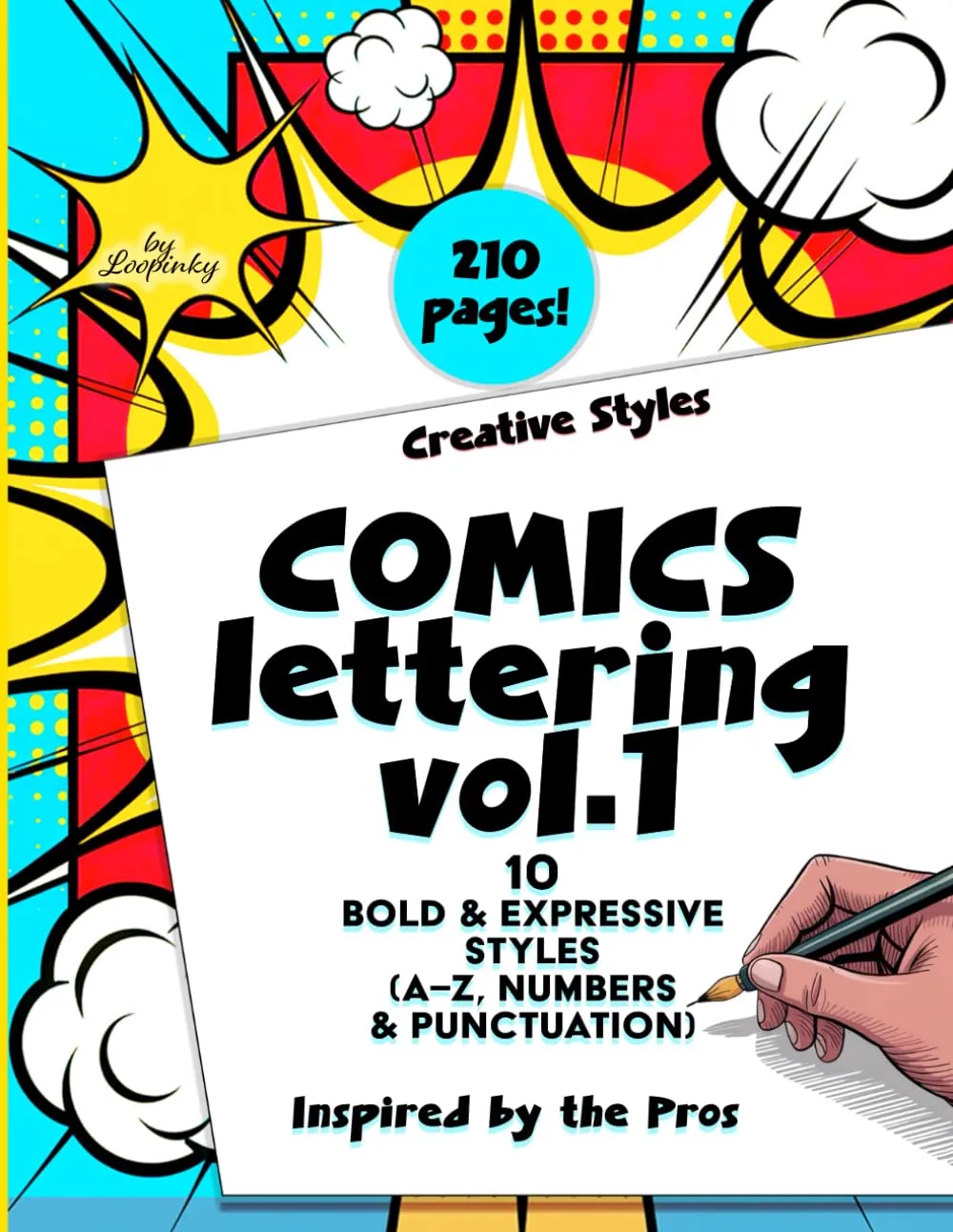
Comics Lettering Vol.1
10 bold lettering styles with complete A-Z alphabets, numbers and punctuation. Master block letters, decorative styles and expressive typography. 210 pages.
Buy on Amazon - $14.99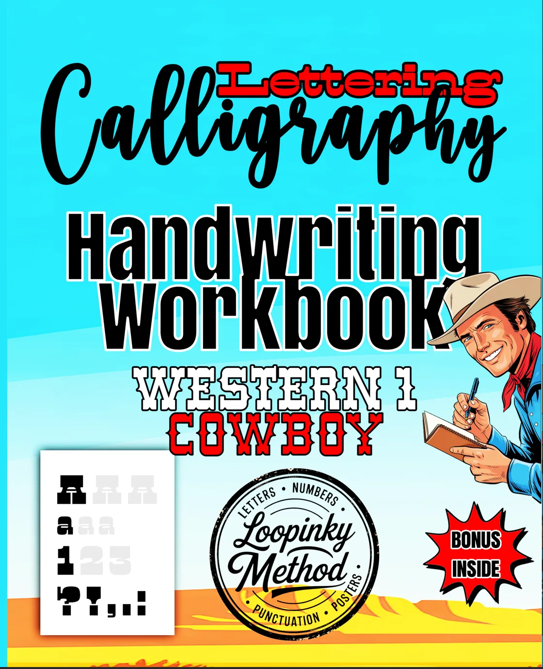
Western Cowboy Lettering
Rustic, vintage-inspired lettering styles perfect for chalkboard signs, cafe menus, and country-themed decor. Complete practice workbook.
Buy on Amazon - $9.99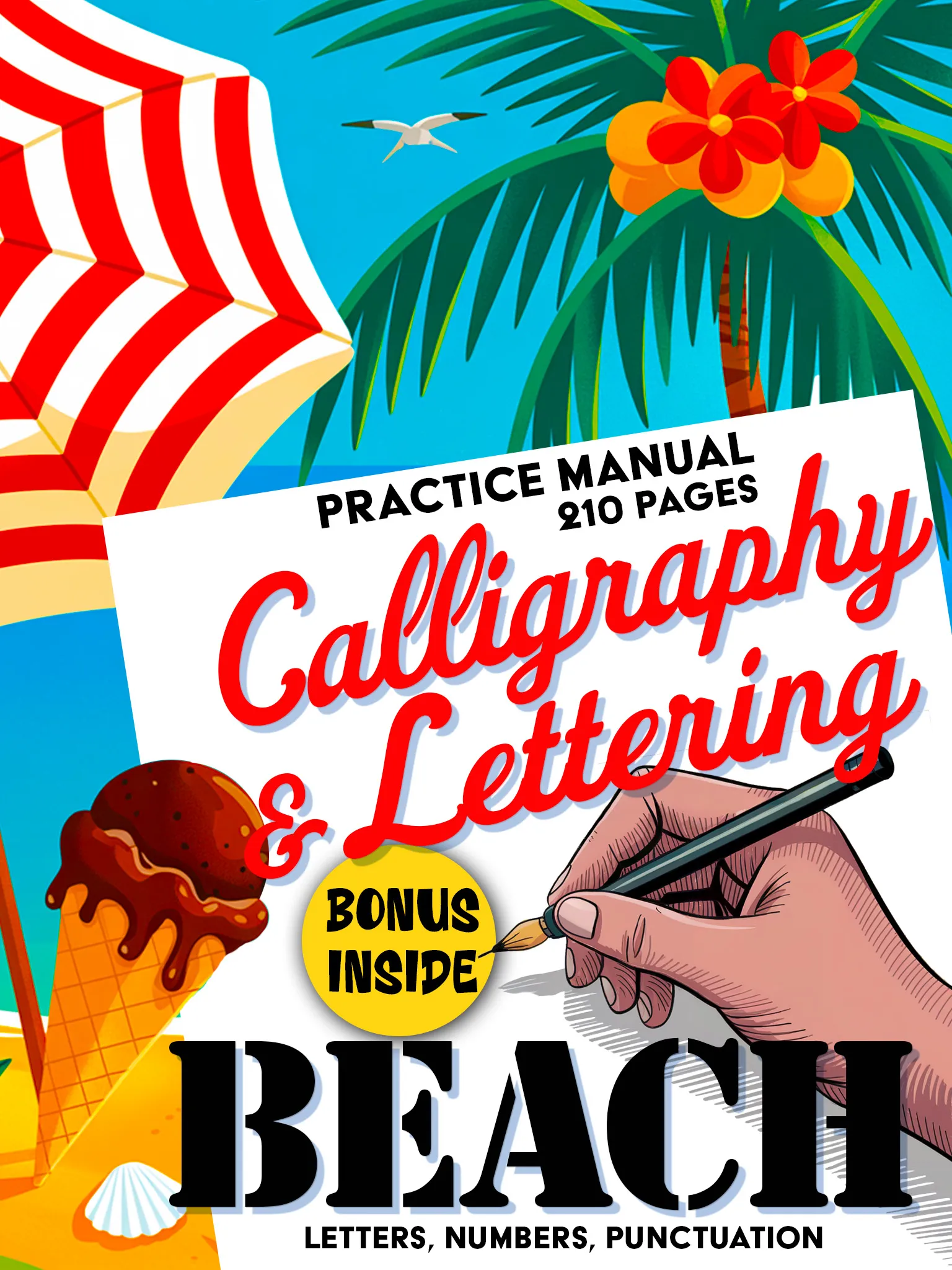
Beach Premium Calligraphy
Elegant calligraphy and hand lettering styles for weddings, events, and decorative signs. 210 pages of guided practice.
Buy on Amazon - $14.99Project Ideas to Try
Ready to put your skills to work? Here are some popular chalkboard lettering projects:
- Kitchen menu board: a classic project. Letter the weekly meal plan or a favorite recipe on a kitchen chalkboard.
- Welcome signs: for your front porch, a party, or a wedding. Welcome signs are the perfect first project because the text is simple.
- Quote boards: display your favorite quotes, rotating them seasonally. Great practice for mixing lettering styles.
- Cafe or shop signage: if you run a small business, handmade chalkboard signs add personality and charm that customers love.
- Holiday decor: seasonal chalkboard lettering for Christmas, Halloween, Thanksgiving, and other celebrations.
- Kids' rooms: names, daily schedules, or inspirational messages in playful chalkboard lettering.
Chalkboard lettering is the beautiful intersection of art and utility. Every sign you create is a one-of-a-kind piece that brings warmth and character to any space.
Ready to build your lettering foundation? Explore the Loopinky workbook collection and start mastering the lettering styles that translate beautifully to chalkboard.