Arabic calligraphy is one of the most revered art forms in human history. For over fourteen centuries, the flowing lines and geometric precision of Arabic script have adorned mosques, palaces, manuscripts, and everyday objects across the Islamic world. More than mere writing, Arabic calligraphy is considered a visual expression of spiritual devotion, a discipline where the beauty of the letter mirrors the beauty of the divine message it carries. For anyone interested in lettering and calligraphy, understanding Arabic script offers a profound appreciation of what the human hand can achieve with ink and intention.
A Brief History of Arabic Calligraphy
The origins of Arabic calligraphy are inseparable from the history of the Quran. When the sacred text was first transcribed in the 7th century, scribes developed strict standards for clarity, accuracy, and beauty. The act of writing the word of God demanded the highest level of craftsmanship, and calligraphy quickly rose to become the most prestigious art form in Islamic culture.
Unlike many other civilizations where calligraphy existed alongside painting and sculpture, Islamic tradition placed calligraphy at the very top of the artistic hierarchy. This elevated status attracted the finest minds and steadiest hands, leading to centuries of innovation in letterform design. By the 10th century, the great calligrapher Ibn Muqla had formalized a proportional system based on the rhombic dot, establishing mathematical relationships between letter heights, widths, and curves that are still studied today.
Over the following centuries, different regions of the Islamic world developed their own distinctive scripts. The Ottoman Empire refined elegant chancery styles, Persian calligraphers created flowing poetic scripts, and North African scribes developed bold Maghrebi letterforms. Each tradition contributed to an astonishingly rich and diverse calligraphic heritage.
Major Arabic Calligraphy Styles
Naskh: The Everyday Standard
Naskh is the most widely used Arabic script today. Developed in the 10th century, it became the standard for printing the Quran and remains the default typeface for Arabic text in books, newspapers, and digital media. Its rounded, open letterforms prioritize legibility without sacrificing elegance. For calligraphy students, Naskh is often the first script to learn because its clear structure teaches fundamental stroke discipline. The balance between thick downstrokes and thin connectors creates a pleasing rhythm that trains the hand for more complex styles.
Thuluth: The Monumental Script
Thuluth is the grand ceremonial script of Arabic calligraphy. Its name means "one third," referring to the proportion of each letter that is straight versus curved. Thuluth letters are large, dramatic, and richly ornamented, making this script the preferred choice for mosque inscriptions, architectural decoration, and chapter headings in manuscripts. Mastering Thuluth is considered the true test of a calligrapher's skill. The elongated vertical strokes and sweeping curves demand absolute control of the reed pen, and the complex rules governing letter connections leave no room for hesitation.
Diwani: The Ottoman Court Script
Diwani emerged in the Ottoman Empire as a script for official court documents. Its densely packed, interwoven letters were intentionally difficult to read, serving as a form of security against forgery. Despite its practical origins, Diwani evolved into one of the most visually stunning calligraphic styles. The letters lean and flow into each other with a distinctive rightward slant, creating compositions that look almost like abstract art. A more elaborate variant, Diwani Jali, adds decorative dots and flourishes that fill every empty space within the text block.
Nastaliq: The Poetry Script
Nastaliq developed in 14th-century Persia and became the dominant script for writing Farsi, Urdu, and other languages influenced by Persian literary culture. Its name combines "Naskh" and "Ta'liq," reflecting its origins as a fusion of two earlier styles. Nastaliq is characterized by a dramatic downward slope from right to left, with short verticals and long, sweeping horizontal baselines. This flowing quality makes it ideally suited to poetry, and some of the greatest works of Persian literature were first written in Nastaliq. The script's organic, almost musical rhythm has inspired calligraphers for seven centuries.
Kufic: The Ancient Angular Script
Kufic is the oldest formal Arabic script, named after the city of Kufa in modern-day Iraq. Unlike the cursive styles that followed it, Kufic is angular and geometric, with strong horizontal emphasis and minimal curves. Early Qurans were written in Kufic, and the script's bold, architectural quality made it perfect for carving into stone and wood. Over time, decorative variants emerged, including foliated Kufic with leaf-like extensions and interlaced Kufic where letters weave together in complex geometric patterns. While no longer used for everyday writing, Kufic remains a powerful design element in Islamic art and modern Arabic typography.
The Tools of Arabic Calligraphy
Traditional Arabic calligraphy is written with a reed pen called a qalam. The tip of the qalam is cut at an angle, and the width of the cut determines the thickness of the strokes. Different scripts require different nib widths, and skilled calligraphers often prepare their own pens, shaping and trimming the reed to exact specifications. The ink, traditionally made from soot, gum arabic, and water, must flow smoothly without bleeding or feathering. The paper is often treated with a coating of starch or alum to create a surface that allows the pen to glide while keeping the ink crisp.
What makes Arabic calligraphy particularly demanding is that the script is written from right to left, with most letters connecting to their neighbors. Each letter changes shape depending on its position in a word, whether it appears at the beginning, middle, or end. This system of contextual forms means that a calligrapher must think several letters ahead, planning the spacing and rhythm of the entire word before the pen touches the page.
Shared Principles with Latin Calligraphy
Although Arabic and Latin scripts look completely different on the surface, the underlying principles of beautiful lettering are remarkably similar. Both traditions value rhythm, the alternation of thick and thin strokes, consistent spacing, and the harmonious relationship between positive forms and negative space. Both require the calligrapher to control pressure, angle, and speed with precision. And both offer a meditative quality, the focused attention and deliberate hand movements that quiet the mind and produce a state of flow.
At Loopinky, our workbooks focus on Latin alphabet calligraphy and lettering, but we deeply respect the traditions that have shaped calligraphic art around the world. The discipline you develop by practicing structured letterforms in any script translates across cultures. If Arabic calligraphy has inspired you to pick up a pen, exploring Latin lettering styles is a natural next step, and vice versa.
Explore Lettering Across Cultures
Loopinky's Beach Premium workbook captures the same sense of flow and rhythm that defines great Arabic calligraphy, translated into Latin script. The 210-page premium manual guides you through fluid, seaside-inspired lettering styles that emphasize the smooth, continuous strokes shared by calligraphic traditions worldwide.
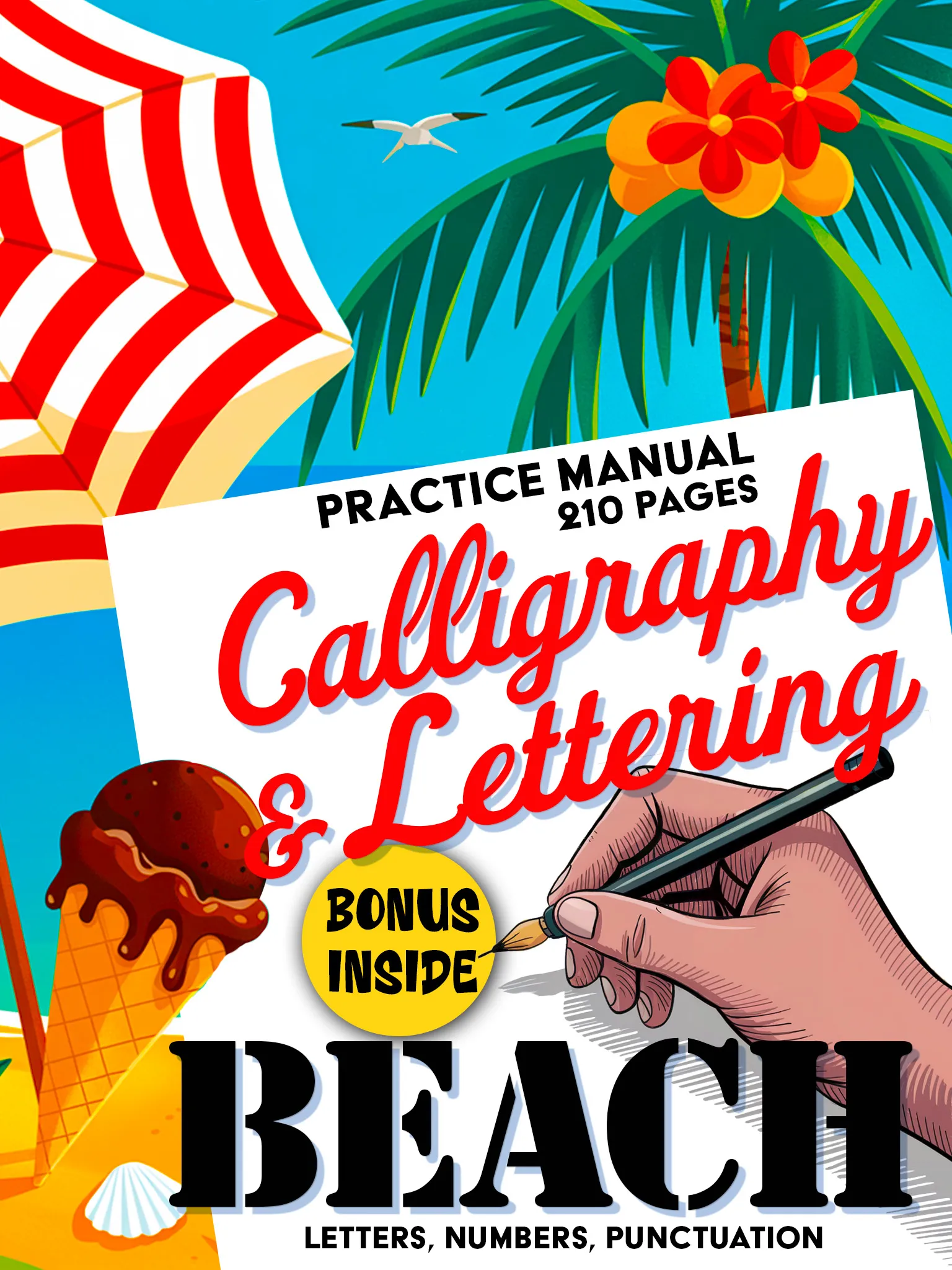
Calligraphy & Lettering: Beach Premium
Premium 210-page calligraphy manual. Fluid scripts, decorative elements and creative layouts.
Buy on Amazon - $14.99For those drawn to variety and the exploration of multiple styles within a single volume, the Drift workbook offers five distinct ocean-inspired lettering styles, each with its own personality and character.
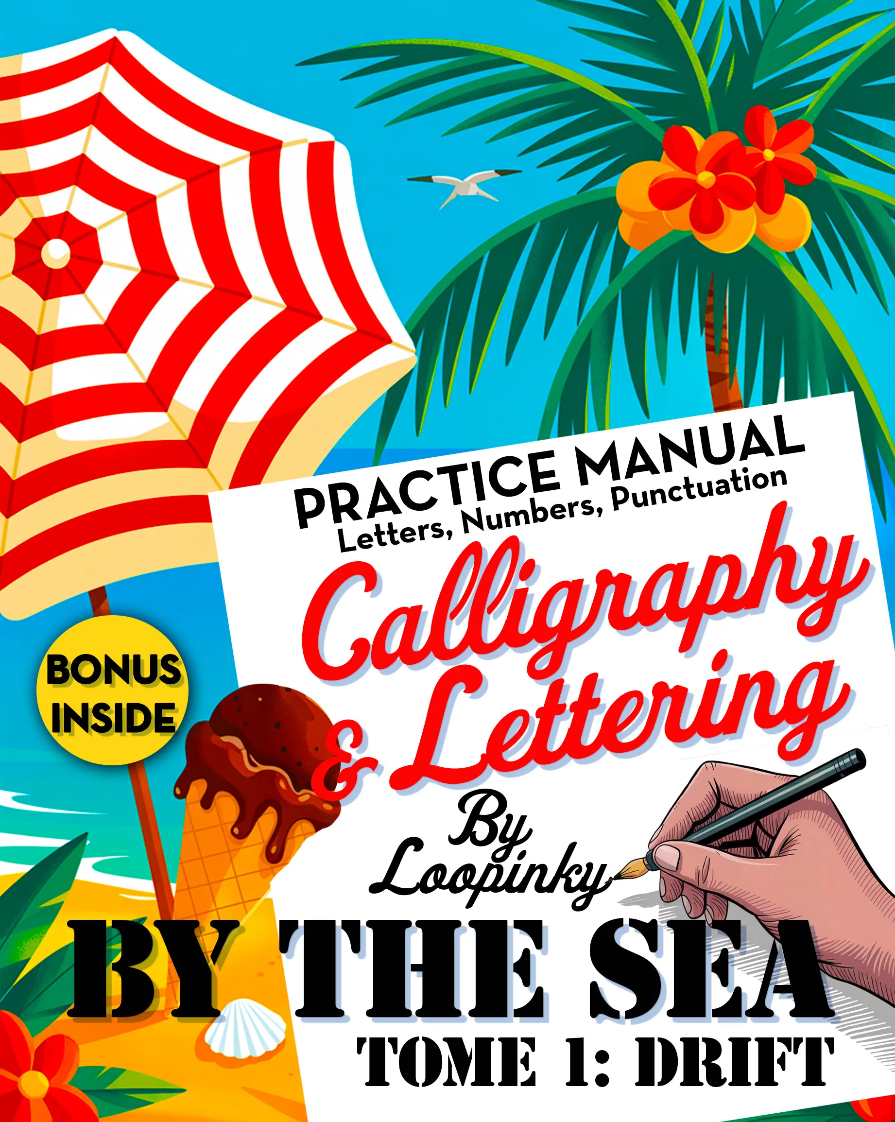
Calligraphy & Lettering: Drift
5 unique ocean-inspired lettering styles. Full alphabets, numbers & punctuation.
Buy on Amazon - $9.99Arabic calligraphy reminds us that lettering is never just writing. It is an art form that connects us to history, culture, and the simple human pleasure of creating something beautiful with our hands. Whether you practice Arabic script, Latin letters, or both, the journey is the same: slow down, focus, and let the letters flow.